Statistical process control (SPC) charts were introduced briefly in the previous column (October 2015). This column will look at the basic ideas behind control charts and how to construct the common X-bar and R chart, one of many types of control charts. (Subsequent columns will cover rules for detecting out-of-control situations and the difference between being out of control and being out of specification.)
Figure 1 shows the relationship between an industrial process and a measurement process (an analytical method). The industrial process makes money as long as the product quality (Q, perhaps a measure of impurity) meets the customer’s specifications. The measurement process examines the output from the industrial process and reports the value of Q, which can be plotted as a function of time or batch number. This information about the industrial process is displayed in the chart in the upper right of Figure 1.
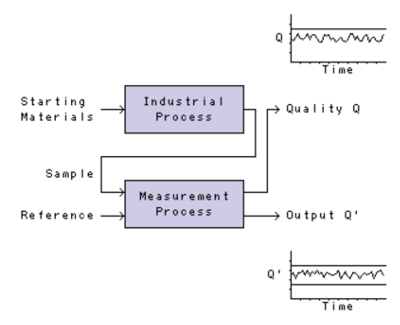 Figure 1 – Control charts for industrial and measurement processes.
Measurement processes are fundamental—they must be known to be valid for their intended purposes and they must be “fit for use.” This generally means they must have sufficiently small bias and sufficiently small imprecision. Bias and imprecision are usually stated after a measurement process has been developed, but those statements are only one “snapshot in time.” (As a consultant, I never trust these statements.) Once implemented, a measurement process changes—analysts change, reagent suppliers change, instruments change, etc. “Requalification” of the measurement process every now and then isn’t sufficient—requalification is just another “snapshot in time.” Instead, it’s important to continuously monitor the performance of the measurement process. How does the measurement process perform from day to day outside the development laboratory? That’s where control charts come in.
Control charts were originally developed in the 1930s by Walter Shewhart1 for monitoring the output of industrial processes. Analytical chemists soon realized that control charts could be used to monitor measurement processes as well. For example, in his classic 1960 textbook, Laitinen2 uses Wernimont’s 1946 application of control charts to compare different weighing methods.3
Figure 2 depicts the start of a control chart for monitoring (let’s say) the performance of a liquid chromatographic method for measuring trace amounts of a toxic impurity. We’ll assume that four times a day—at 8:00 a.m., 11:00 a.m., 2:00 p.m. and 5:00 p.m.—we put a reference material through the chromatograph and measure the peak area of the impurity, Q’. The upper part of the control chart is known today as a spreadsheet. Each column represents a “rational subgroup”4 of the data. We’ll use “day” as our rational subgroup and record the four peak areas obtained each day. On day one, the peak areas are 49.62, 48.23, 54.83 and 49.05 integrator counts. Their mean (X-bar) is 50.43, and their range (R, the difference between the largest and smallest values) is 6.60. Let’s say I was the analyst on day one, and I’ve put my initials (SND) proudly in the spreadsheet.
 Figure 2 – An
 X
-bar and R
control chart.Below the spreadsheet are two charts—the upper chart for recording values of X-bar, and the lower chart for recording values of R. These charts are usually not scaled until several sets of data have been collected, but, because I know what the full set of data will look like (you won’t), I’ve gone ahead and scaled them so the future data will fit on them. The value of 50.43 has been plotted in the X-bar chart, and the value of 6.60 has been plotted in the R chart.
The next day, Stephen L. Morgan is the analyst. He obtains values of 48.85, 48.78, 49.22 and 51.10 integrator counts. The average this second day is 49.49 and the range is 2.32. Steve dutifully plots these points in the X-bar and R charts and initials his work (SLM). It’s traditional to link the data points in these charts with straight lines.
Let me interrupt our progress for a moment and make two points.
First, update these control charts on a timely basis. These charts are the only way the process can “talk to you.” You need to “listen” (with your eyes) continually. Although there are computer programs that can do all the calculations and plotting for you, I discourage their use—there’s a tendency to wait until the end of the month to input all your data and then make the charts so that you can include them in your monthly report. If the measurement process had gone out of control earlier in the month, it’s far too late now to discover the “assignable cause”—the opportunity has been lost. You need to listen each day. Making these charts manually (yes, with old-fashioned paper and pencil) isn’t a bad idea.
Second, hide these control charts from managers, especially micromanagers. There are exceptions, of course, but many managers don’t understand the nature of random variation. These managers think every effect has a cause. For example, they might see that the mean has decreased from 50.43 to 49.49 and speculate about a reason for it: “Wow! That reference material must be going bad! Replace it. Now!” Whoa. Maybe, maybe not. The difference might just be random variation at work. Let’s wait a while and see what happens. A manager might see that the range has decreased from 6.60 to only 2.32. Somewhere this manager knows that a small range means small variation, and small variation is good: “Wow! That Steve Morgan is a careful worker! Let’s reward him with a steak dinner and lots of ‘attaboys’ for his good hands. And old Stan? Looks like he’s over the hill and we need to replace him.” Whoa. Hold on. Maybe Steve was just lucky that day. Let’s wait a while and see what happens.
Suppose now we’re at our ninth rational subgroup in Figure 2. Statisticians would say that the data “appear to be in statistical control”—that is, the variation in the data is what would be expected from small random effects. With enough data behind us, we can calculate control limits for both the X-bar and R charts. Details may be found in some of the classic texts. I like any of Don Wheeler’s writings4 and the classic text by Grant and Leavenworth.5 (Go to an inexpensive used book site like addall.com. You don’t need modern texts—this stuff hasn’t changed in nearly a century, and there’ve been very, very few improvements over the original.)
A common question is, “How many subgroups do I need before I calculate the control limits?” Most statisticians recommend 20–30 subgroups. However, as Wheeler points out,4 these “limits are very robust…they even work with small amounts of data…. [W]hen limited amounts of data are available, go ahead and calculate control limits, and then, if and when additional data become available, recalculate the limits.”
The lower (LCLX) and upper (UCLX) three-sigma (3σ) control limits for the X-bar chart (based on 20 sets of data, not all shown here) are 42.78 and 53.57, respectively, as shown by the green horizontal lines in Figure 2. The upper control limit for the R chart (UCLR) is 16.89 and is shown by a blue line in Figure 2. The lower control limit for the R chart (LCLR) is usually indistinguishable from the horizontal axis until the subgroup size gets up to about seven and does not appear in Figure 2.
What do these control limits mean? If this process behaves in the future as it has in the past, the risk of obtaining a subgroup mean or a subgroup range outside these control limits in either the X-bar chart or the R chart is approximately equal to 0.00270. That is, approximately 99.7% of the time the subgroup means and subgroup ranges will lie between the control limits. If they don’t lie between the control limits…well, that’s the subject of the next column.
References
- Shewhart, W.A. Statistical Method from the Viewpoint of Quality Control; Deming, W. Edwards, Ed.; Graduate School, U.S. Department of Agriculture: Washington, D.C., 1939.
- Laitinen, H.A. Statistics in Quantitative Analysis. In Chemical Analysis: An Advanced Text and Reference; McGraw-Hill: New York, N.Y., 1960; Chapter 26.
- Wernimont, G. Use of control charts in the analytical laboratory. Ind. Eng. Chem. Anal. Ed. 1946, 18(10), 587–92 [doi: 10.1021/i560158a001].
- Wheeler, D.J. Advanced Topics in Statistical Process Control: The Power of Shewhart’s Charts; SPC Press: Knoxville, Tenn., 1995.
- Grant, E.L. and Leavenworth, R.S. Statistical Quality Control, 6th ed.; McGraw-Hill: New York, N.Y., 1988 [ISBN 0-07-024117-1].
Dr. Stanley N. Deming is an analytical chemist who can be found, as he says, masquerading as a statistician, at Statistical Designs, 8423 Garden Parks Dr., Houston, Texas 77075-4731, U.S.A.; e-mail: [email protected]; www.statisticaldesigns.com