In the previous article (Part 27, American Laboratory, Sept 2007), the world of detection was shown to revolve around three variables: 1) the detection limit, 2) the probability of false positives, α, and 3) the probability of false negatives, β. As a matter of fact, these three quantities are related by a single equation, meaning that only two of the three variables can be selected by the user.

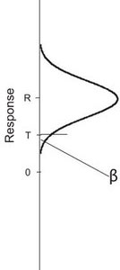
Figure
1 - Line representing the response of an instrument. The three points
shown are: 1) zero response, 2) the threshold response, T, below which a
response is indistinguishable from zero, and 3) the signal, R, from a
low-concentration standard.
The obvious next question is, “What is the relevant equation and how is it derived?” The answer is fairly lengthy and will be addressed over the course of the next few articles. The discussions will: 1) present background material, 2) relate the three variables via the usual regression plot (such as is used for calibration and recovery curves), and 3) derive the equation itself.
To understand detection limits, one starts with the concepts of α and β. In Figure 1, the y-axis is in instrumental-response units, in the region “near” zero. Three points are shown: 1) zero response itself, 2) T, the threshold response, below which a response cannot be distinguished from zero, and 3) the response, R, from a low-level concentration (R can be distinguished from zero).
If a blank sample (i.e., an analyte-free sample) is tested in replicate, a distribution (assumed Normal) of responses will be obtained (see Figure 2). The curve will be centered (approximately) at zero response units. The upper tail of the curve will intersect T. The curve’s area that is above T is α, the probability of a false positive. This fact stands to reason, since any time a blank’s analysis yields a response that is above the threshold, a false positive (or false detection) has occurred. As a result, the values of T and of α are inextricably linked. Once one value has been set, the other has been determined as well; if T is decreased, α must increase, and vice versa.
Figure 3 depicts another situation. Shown is the frequency distribution for a lowlevel standard (with average response R) that has been analyzed in replicate. In this case, the lower portion of the curve intersects T. Since any response below T cannot be distinguished from zero, such a result for an actual standard represents a false negative. Thus, the curve’s area below T is β. If the frequency distribution for a different low-level concentration is plotted (i.e., if the value of R is either raised or lowered), then the area representing β will change as well. Assuming a fixed distribution, the area (β) will decrease as response R increases, since the tail is being pulled upwards such that less area falls below T. Conversely, the area (β) will increase as response R decreases, since the tail is being pushed downwards so that more area falls below T. As a result, the values of R and of β are inextricably linked.

Figure
2 - Distribution of responses obtained from analyzing a blank sample in
replicate. The y-axis is in instrumental-response units; the x-axis has
units of frequency of occurrence.
Figure
3 - Distribution of responses obtained from analyzing a low-level
sample in replicate. The distribution is centered at response R. The
y-axis is in instrumental- response units; the x-axis has units of
frequency of occurrence.

Figure
4 - Plot combining Figures 2 and 3 into one graph. The y-axis is in
instrumental-response units; the x-axis has units of frequency of
occurrence.
In Figure 4, the combined plots are shown. For a given set of distributions for a blank and for a low-level standard, there exists a threshold, T. Furthermore, along with that T, values for α (false-positive probability) and β (false-negative probability) exist simultaneously. For a given analytical system, three scenarios are possible. First, if the value of α (i.e., the threshold, T) and the value of β are selected by the user, then the concentration associated with R is determined (i.e., the concentration no longer can be chosen arbitrarily). Second, if the value of α and the concentration associated with R are selected by the user, then the value of β results automatically. Third, if the value of α and the concentration associated with R are selected by the user, then the value of β has been set. Given a fixed response distribution for the blank and for the standard associated with R, there is no scenario in which α, β, and R’s concentration can all be chosen simultaneously by the user.

Figure 5 - Representation of a calibration curve with its associated prediction interval. The y-axis is in instrumental-response units; the x-axis has units of concentration.
With this background in mind (especially the above sentences in italics), it is appropriate to think about a typical calibration curve with its associated prediction interval. Figure 5 is such an example. As has been discussed in past columns, the width of the prediction interval depends in part on the confidence level that has been chosen. Since the confidence level is [100% – (α + β)], it stands to reason that the values of α and β influence the distance from each prediction-interval line (each of which is called a limit) to the calibration line. Indeed, it turns out that the value of α is linked with the upper prediction limit, and the value of β is linked with the lower prediction limit. While α and β are usually allowed to have the same value, such a situation is not mandatory. If unequal probabilities are chosen, then the lines will not be equidistant from the calibration line.

Figure 6 - Overlay of Figures 4 and 5, with the addition of the y = T line and the relocation of concentration r’s distribution to the x = r position on the x-axis. The y-axis is in instrumental-response units; the x-axis has units of frequency of occurrence (for the Normal curves) and of concentration (for the calibration curve and prediction interval).
Figures 4 and 5 can be combined into one graph, if the x-axis is allowed to represent two variables (i.e., frequency of occurrence and concentration) simultaneously. (Such a “doubling up” avoids the awkward need for a 3-D plot.) The result is shown in Figure 6. (To avoid cluttering, only the concentration scale is shown on the x-axis.) The concentration associated with response R is designated as r on the x-axis. The line for y = T is included. For clarity’s sake, the frequency distribution for concentration r has been relocated to the position where x = r on the x-axis.
At this time, the reader is encouraged to study Figure 6, and to think about it in light of the above discussion about R (or r), α (or T), and β. In the next installment, this plot will be used to discuss further the relationship among the detection limit, α, and β.
Mr. Coleman is an Applied Statistician, Alcoa Technical Center, MST-C, 100 Technical Dr., Alcoa Center, PA 15069, U.S.A.; e-mail: [email protected]. Ms. Vanatta is an Analytical Chemist, Air Liquide-Balazs™ Analytical Services, Box 650311, MS 301, Dallas, TX 75265, U.S.A.; tel.: 972-995-7541; fax: 972-995-3204; e-mail: [email protected].