This month’s installment is the second in a series of real-world examples of calibration diagnostics. The analyte is nitrite and was part of the same trace-level work from which chloride (Part 11, American Laboratory May 2004) was taken. In this particular ion-chromatography procedure, chloride and nitrite exhibit retention times that are only approx. 1 min apart. For a given mass that is injected onto the column, both anions have very similar response factors.
The calibration design was detailed in Part 6 (American Laboratory July 2003) and was the same as for chloride. Eight replicate injections were made of each of nine standards (i.e., a blank, 25, 37.5, 50, 62.5, 75, 100, 150, and 200 ppt). As with chloride, a straight-line model with ordinary-least-squares (OLS) fitting was proposed to fit the data.
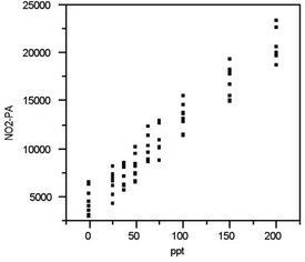
Figure 1 - Scatterplot for the nitrite data. No extreme data points
are noted and the pattern appears consistent with the straight-line
model that was postulated for these results.
Step 1: Plot response versus true concentration
Figure 1 shows the scatterplot for the nitrite data. (Note: “NO2-PA” stands for the peak area of the nitrite peak.) No points appear to be candidates for outliers. Furthermore, nothing in the graph indicates that the data exhibit curvature. These impressions will be examined in more detail in the subsequent diagnostic tests below.
Step 2: Determine the behavior of the standard deviation of the response
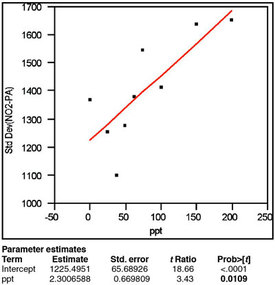
Figure 2 - The plot of response standard deviation versus true
concentration has been fitted with a straight line using OLS as the
fitting technique. The p-value (0.0109, in boldface) for the slope
indicates that the standard deviation does not increase
with concentration.
The results of standard deviation modeling are presented in Figure 2. To generate this graph, the standard deviation of the responses is calculated for each true concentration (nine in all). These statistics are plotted versus the true concentration; the data are fitted with a straight line using OLS (technically, there are more suitable fitting techniques for standard-deviation-versus-concentration data, but they are more complex and yield similar results). The significant regression result is the p-value for the slope of the line (labeled “ppt” in the “Parameter estimates” and in boldface in the figure). This value of 0.0109 is above (albeit barely) the cutoff of 1%; thus, OLS fitting is appropriate (i.e., the standard deviation does not show a statistically significant change with concentration, making weighted least squares [WLS] unnecessary).
Step 3: Fit the proposed model and evaluate R2adj
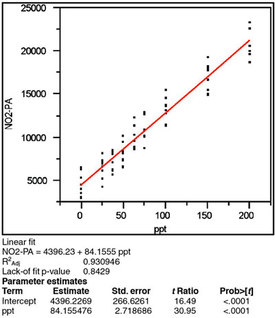
Figure 3 - Scatterplot (as shown in Figure 1) fitted with a straight
line using OLS. The statistics of R2adj, lack-of-fit p-value, and p-value
for the slope (“ppt” under “Parameter estimates”) all indicate
that this model and fitting technique are appropriate for these data.
Once the appropriate fitting technique has been determined, the proposed model is fit to the data and the adjusted R2 is examined. As was the case with chloride in Part 11, the adjusted R2 is less than the hoped-for value of at least 0.99 (see Figure 3). However, it is again emphasized that this statistic is not a strong tool in calibration diagnostics; therefore this 0.93 result is sufficiently high.
Step 4: Examine the residuals for nonrandomness
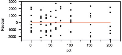
Figure 4 - Residual pattern that accompanies the plot in Figure 3.
The residual pattern shows a slight sinusoidal pattern (see Figure 4). However, the shape is not blatant. Thus, a straight line appears to be adequate to explain the data. In addition, the lack of a distinct trumpet shape validates the decision to use OLS as the fitting technique. (If the standard deviation of the responses were changing markedly with concentration, a flaring pattern would be noticeable.)
Step 5: Evaluate the p-value for the slope
The p-value for the slope is found in Figure 3 (the “ppt” term under “Parameter estimates”). As expected, this result is less than 1%, meaning that a straight-line regression model is better than the starting hypothesis (which is a straight line parallel to the x-axis).
Step 6: Perform a lack-of-fit-test
Further validation of the choice of a straight-line model comes from the p-value (seen in Figure 3) for the lack-of-fit test. The starting assumption for this test is that there is no lack of fit. Thus, the p-value of 0.8429 for nitrite indicates no evidence of lack of fit, since the number is above the cutoff of 0.05. Consequently, no additional terms are needed in the model.
Step 7: Plot and evaluate the prediction interval
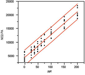
Figure 5 - Figure 3, along with the prediction interval (at 95%
confidence).
All of the above diagnostics have indicated that the choice of a straight line with OLS fitting cannot be rejected on statistical grounds, so that combination is accepted as appropriate to explain the nitrite data. In Figure 5, the calibration curve itself and the associated prediction interval (at 95% confidence) are shown. Because of the high number of data points and the consistency of the responses’ standard deviations, the upper and lower interval lines are nearly parallel to the calibration line.
If any region of the plot is enlarged, the width of the interval is seen to be approx. ±30 ppt. This result is considerably higher than the width (±10 ppt) for chloride (in the preceding article) and is the main reason for having presented the nitrite example along with the chloride one. The take-home message is that the calibration behavior of a given analyte should not be predicted from the findings of another species. This warning applies even if both analytes are part of the same analytical method and even if both exhibit similar responses in the chosen instrument. As always, only the user can decide if the width of the prediction interval is acceptable for the situation at hand.
To emphasize the appropriateness of the straight-line model, a plot is presented in Figure 6. In this graph, a quadratic is fitted using OLS. The p-value for the quadratic term is 0.8021, well above the cutoff of 0.01. Thus, this term is not statistically significant, and use of a second-order polynomial (or other higher-order models) would result in overfitting.
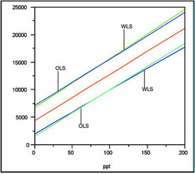
Figure 7 - Overlay plot of data regressed with 1) a straight
line using OLS fitting, and 2) a straight line using WLS fitting.
Note that the center-most line represents the two regression
lines, which are indistinguishable from each other. Because the
change in standard deviation (from low to high concentration)
is so slight, the prediction intervals flare only slightly with WLS.
To avoid clutter, the individual data points are not shown.
Units on the y-axis are peak areas.
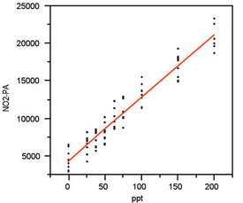
Figure 6 - Scatterplot from Figure 1, this time with a quadratic
model fitted using OLS. The p-value for the quadratic term is high
(0.8021), thereby indicating that this term is not needed. Thus,
use of a quadratic model would result in overfitting of the data and
should not be used.
Finally, a plot is presented (Figure 7) that shows the similarity and slight differences between WLS and OLS for these data. WLS prediction intervals show a very mild version of the usual “trumpet effect” (i.e., narrow near concentration = 0 and widening as concentration increases). The reason the effect is mild (to the point where WLS and OLS are almost the same) is due to an important fact. The relative change in standard deviation is practically unimportant (~32% increase). Had there been, for example, a tenfold increase, a clear trumpet would have been seen.
Mr. Coleman is an Applied Statistician, Alcoa Technical Center, MST-C, 100 Technical Dr., Alcoa Center, PA 15069, U.S.A.; e-mail: [email protected]. Ms. Vanatta is an Analytical Chemist, Air Liquide-Balazs™ Analytical Services, Box 650311, MS 301, Dallas, TX 75265, U.S.A.; tel: 972-995-7541; fax: 972-995-3204; e-mail: [email protected].